


The Best Blue Paint Colors for Cabinets
Are you looking for the perfect hue of blue to paint your walls or cabinets? You’re in luck! We’ve rounded up the best shades of blue paint from light teal to deep navy so that you can create an inviting, soothing space with just the right type of color.
Focus on Colors with Neutral and Earthy Undertones
The best hues of blue can be found in colors that have neutral and earthy undertones to them. Most assume when selecting a color for cabinets or built-ins that the bolder the better, but if you’re looking for a timeless look, it’s actually beneficial to stick with colors with a neutral base. Once it’s on the surface you’ll be surprised by how much the color still pops!
Now, just because the color should have natural undertones doesn’t mean your color options are limited. Shades like sea foam, powder blue, navy, and periwinkle are all great choices for painting cabinets or walls. But when you’re selecting the actual shade, find the strip on your color wheel that feels more muted or could be found in nature.
If you still feel stuck.. we’ve done the hard work and gathered the best blue paint colors for any cabinetry or room!
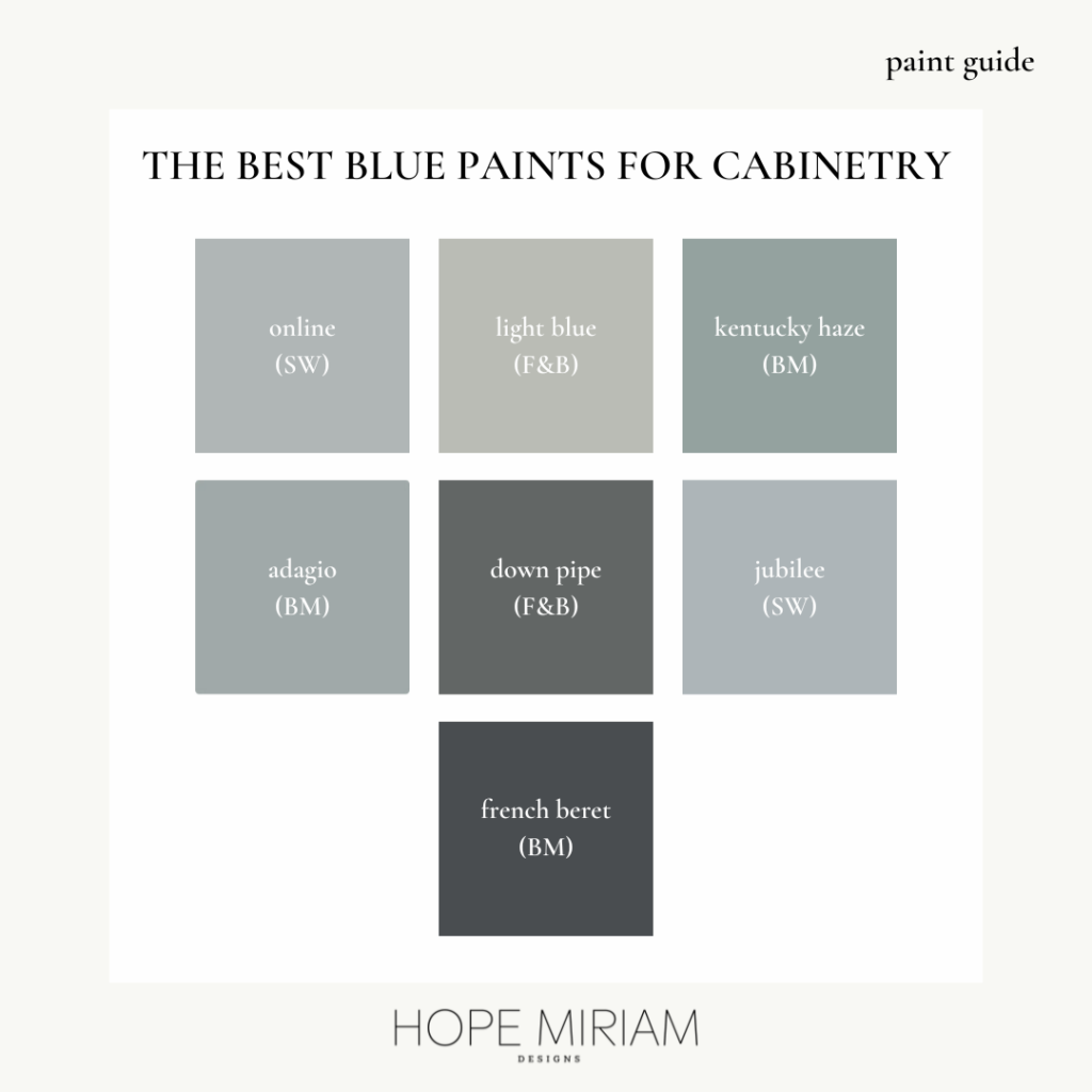
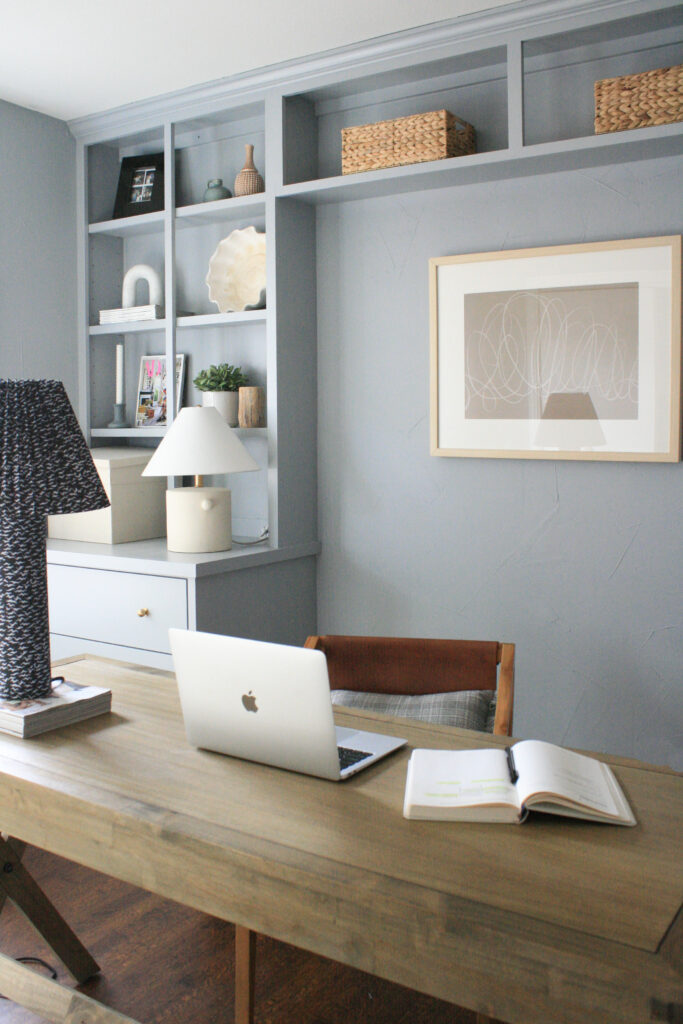
No 1. | Sherwin Williams Online
This color is actually found in the gray section of Sherwin William’s color wheel. It’s a calming shade that reflects just the right amount of blue. In the design below, we used the same color on the built in cabinetry as the walls to create a seamless look to the entire room. Depending on the decor and furnishings, Online can either feel feminine or is the perfect backdrop for a boy’s nursery.
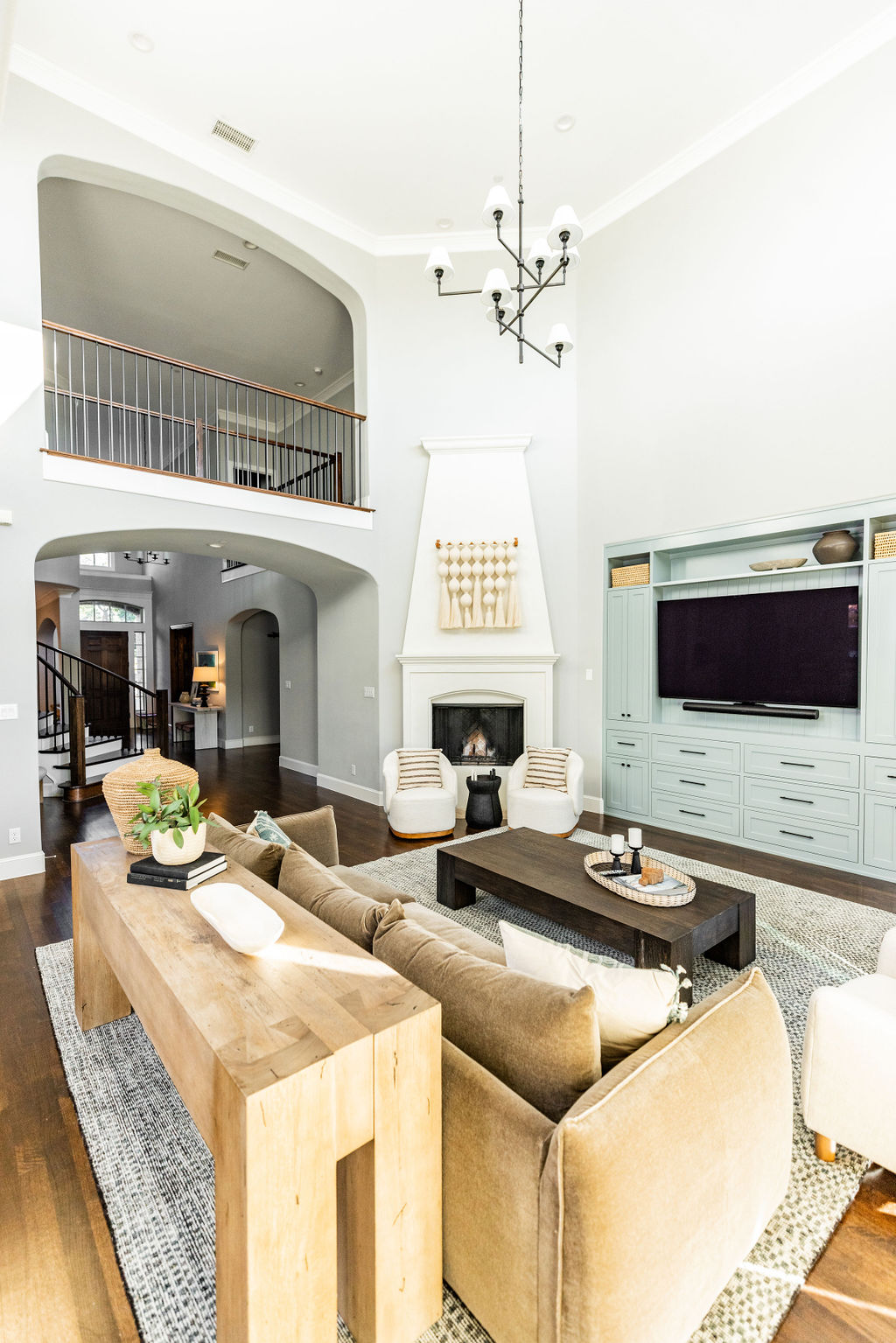
No. 2 | Benjamin Moore Kentucky Haze
This color is a beautiful combination of blue-green. The shade has a lot of depth in the way it can reflect differing colors depending on the lighting. The living room below was for a client that wanted a calm, bright space with some infused personality. Kentucky Haze pairs beautifully with wood tones and black accents.
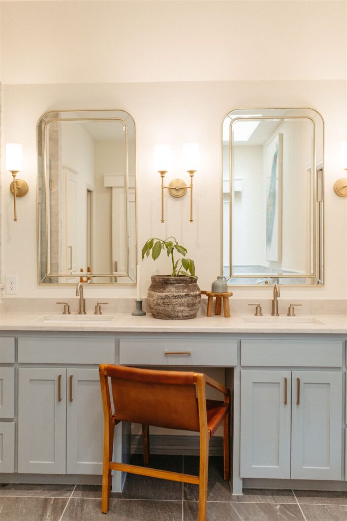
No. 3 | Sherwin Williams Jubilee
While this color may look very similar to Online (SW) on a swatch, it has a bit more energy. Jubilee is a crisp blue that complements champagne bronze hardware perfectly. This color also works well in spaces that don’t have a lot of natural light since the color itself is energetic.
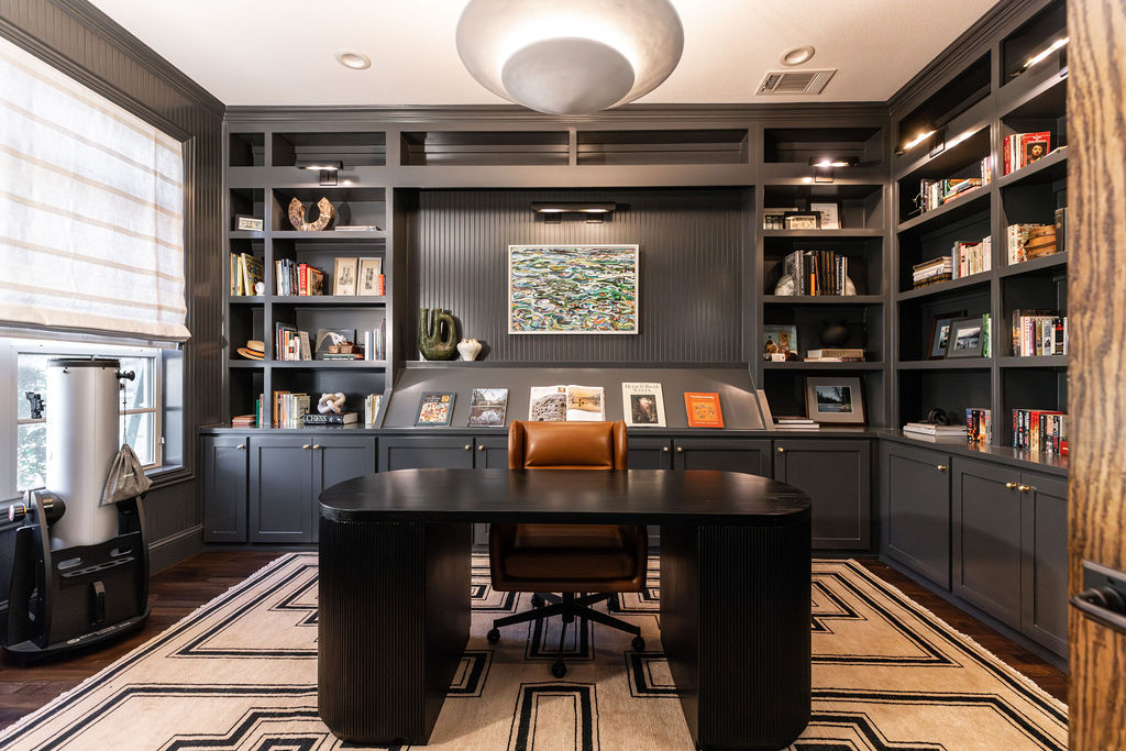
No 4. | Benjamin Moore French Beret
We used this color for one of our office renovations that was made into a library. This blue paint is a versatile navy that looks good regardless of the surface. Due to the deeper color, it’s important to evaluate the lighting near the cabinetry or else the color can appear almost black.
Feeling excited about incorporating blue into your home? Any of the blue paint colors mentioned are tried and true. Let us know what other color families you are interested in learning more about!
Sincerely,
HMD

